
XO Lite components
Explore the inner workings of XO Lite's component-based design and how it enhances user experience in virtualization management through our in-depth blog post.


After giving you an overview of the general design in a previous blog post, we're now ready to dive into the finer details, focusing on the key components that make XO Lite so intuitive and user-friendly. If you missed the first article, it's here:
 Clémence Barthoux
This time, we'll talk about components! But first, why working with a component approach?
🧱 Components
Embracing a component-based approach to web design is crucial for several reasons. Here are some of the key advantages that have informed our decision to use this methodology for XO Lite:
- Reusability: Components are modular building blocks that can be reused throughout the application, resulting in a more efficient development process. This reduces the need for repetitive code, streamlines updates, and minimizes the risk of introducing bugs.
- Scalability: As your application grows in complexity, a component-based architecture allows for seamless scaling. By encapsulating functionality into self-contained components, developers can easily add, modify, or remove parts of the application without disrupting the overall system.
- Maintainability: A well-structured component-based architecture makes it easier for developers to understand, maintain, and troubleshoot the codebase. With a clear separation of concerns and a predictable structure, it becomes simpler to diagnose and fix issues, ensuring a stable and high-quality end product.
- Collaboration: By breaking down the UI into individual components, teams can work more efficiently by focusing on specific parts of the application. This promotes parallel development and enables team members with different skill sets to contribute effectively.
- Customization: Component-based design allows for greater flexibility in tailoring the application to specific needs. Developers can easily swap out or modify components to create a customized experience without compromising the integrity of the overall system.
Components are great, but we need to build something that fits with the user need, we can be called a "story".
🧚 A quick recap on the "story"
In web development, the term "story" is often used in the context of a development methodology called "User Story" within Agile software development frameworks, such as Scrum. A User Story is a short, informal description of a software feature from the perspective of an end-user. It helps developers and designers understand the user's needs and expectations, ensuring that the final product aligns with the target audience's requirements.
Mixing both components and the capability of building stories? You have your component stories!
🪄 Component Stories
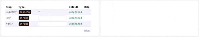
In our quest for better documentation and testing, as we were not satisfied with existing options, we've developed our own story system for our components. This system allows us to thoroughly document component properties, types (numbers, strings, objects, etc.), requirements, and default values.
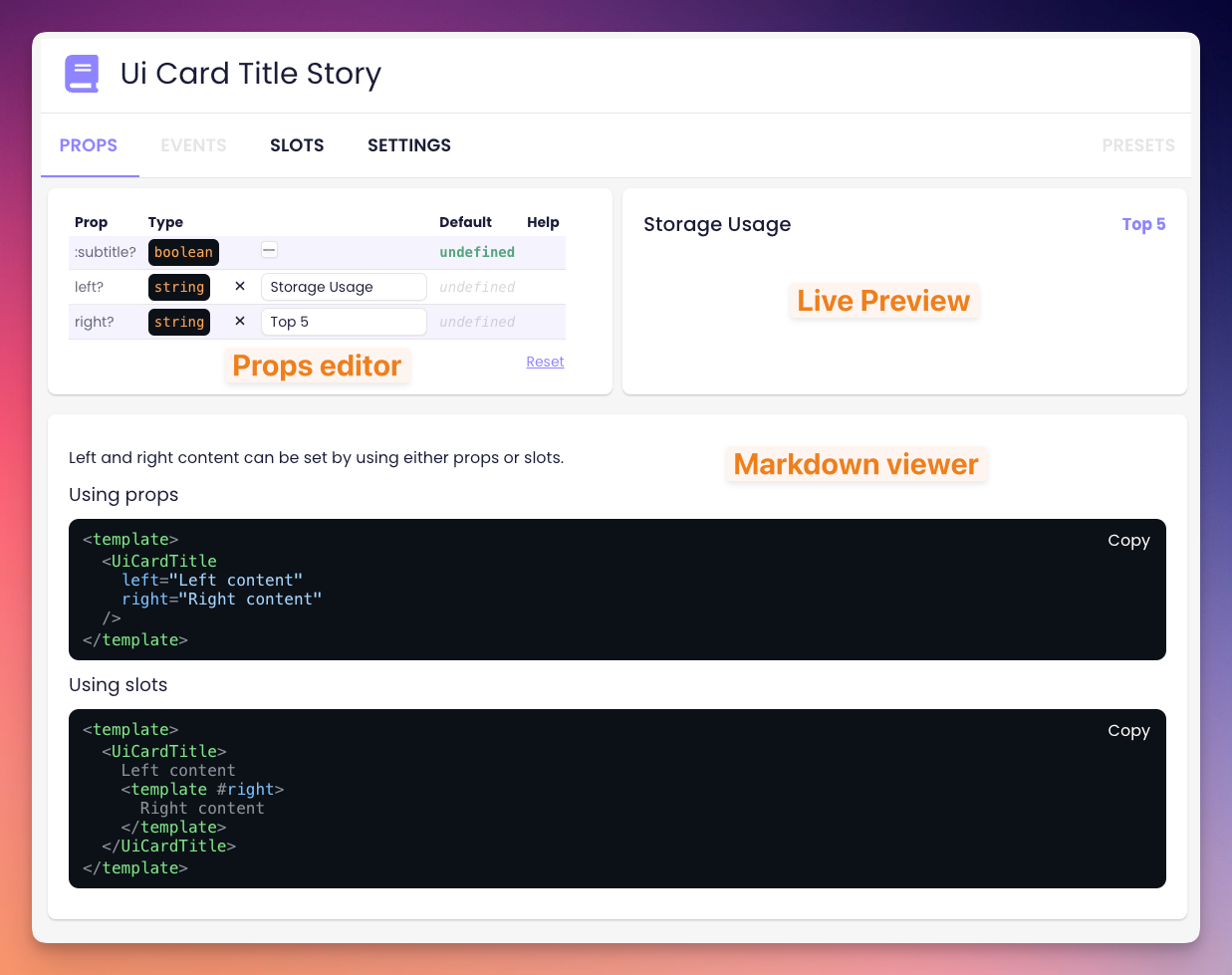
Our story system is fully interactive. Developers can modify prop values and instantly see the results, enhancing the documentation experience. Furthermore, we've included comprehensive documentation for component events, including function types, arguments, and a real-time logging system to monitor triggered events.
Our system also supports the documentation of component slots, including named slots and scoped slots. For scoped slots, we even provide documentation for slot props and their respective types.
To further enhance customization, we've incorporated settings that aren't part of the component itself but allow dynamic values (e.g., for use as slot content). The system also enables developers to define presets, which pre-fill props and/or settings.
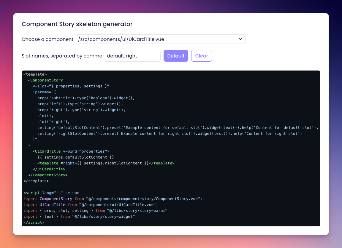
Additionally, we've developed a basic generator that allows users to select a component and automatically generate a story skeleton, making it easier to create new stories for components:
Lastly, we've made it simple to include supplementary information by allowing users to add a Markdown file next to the story file. This file is parsed and displayed alongside the component story page, providing a seamless documentation experience.
In summary, our interactive component story system offers a powerful and user-friendly way to document and test components while providing real-time feedback and customization options. With this system in place, developers can create, modify, and understand components more effectively than ever before.
Constructing these tools demands time and effort, yet they will prove to be immensely beneficial in accelerating the development process for both XO Lite and the new user interfaces in Xen Orchestra 6.