
Xen Orchestra responsive design

Some people complains (understandably) about the malformed display of Xen Orchestra on smaller devices. That's why we introduced three mechanisms to allow a better user experience (UX) on small screens:
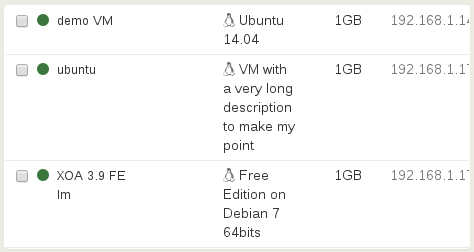
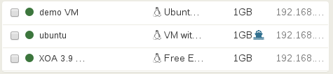
- use "..." (ellipsis) avoiding large multi-lines in our tables. Now, even a long description won't brake the layout!
- hide non-critical information: you can always interact with the software on a phone.
- compact some menus when needed.
These new enhancements will be available for the huge Xen Orchestra 4.0 coming soon.
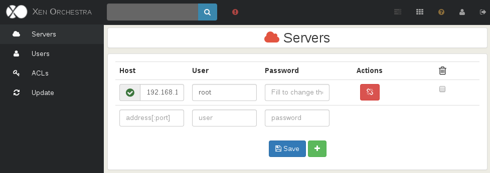
Before:
And after (same window size, shrink 50% in height!):
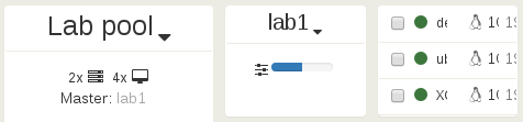
And for a very small device (phone), before:
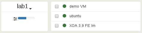
After (yeah, we removed the Pool, which is not critical when viewed from a phone):
These improvements are just a start, we'll dedicate more and more work done in UX for the next months!
Same thing for the setting view, before:
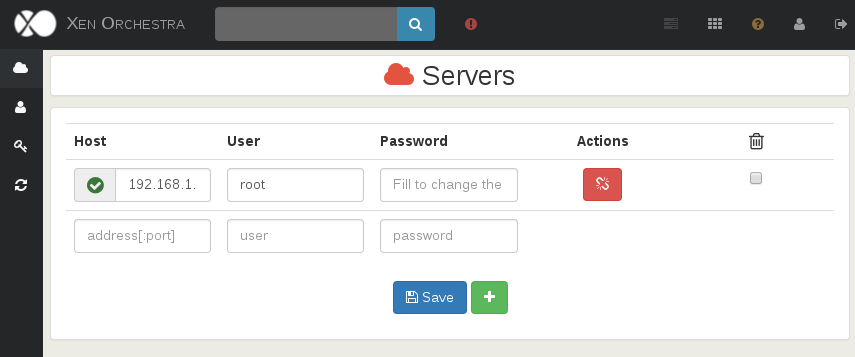
And after:
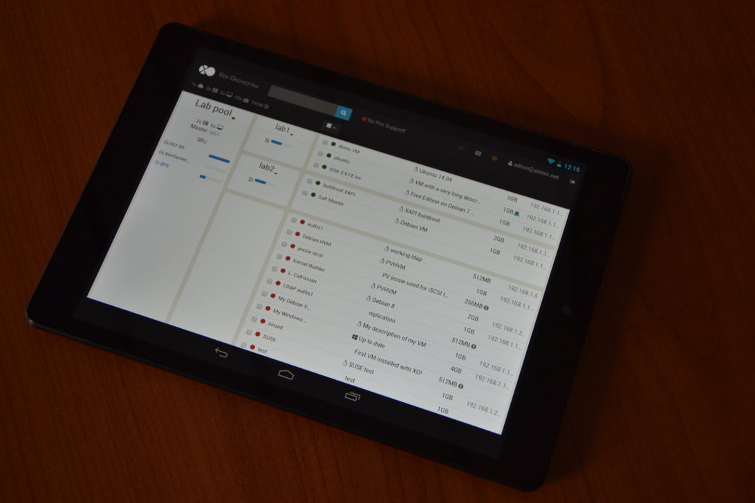
On real devices
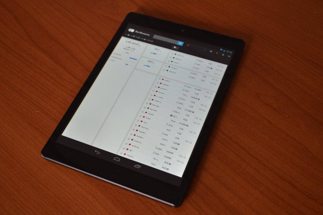
Tablet
And the result for a real tablet? Here some shots with a 7.85" device:
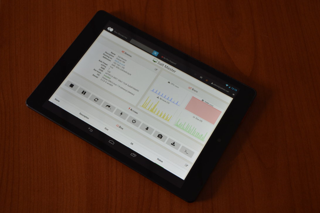
And in the "worst" case (vertical display), it stays usable:
Phone
Ok, let's try to go further. Now on a Moto G with a small 4.5" screen:
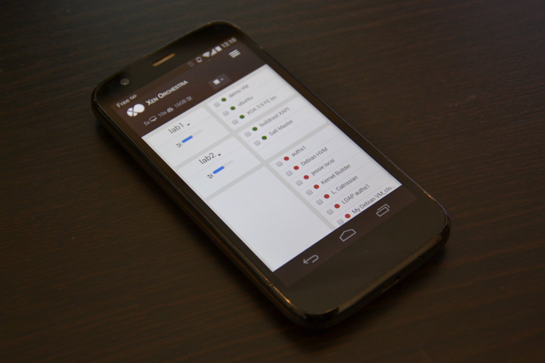
As you may seen, we removed the Pools column, but this is the small price to pay for keeping to play with XO on a very small device ;)
Well, at least you can now use all the possibilities of XenServer and Xen Orchestra from any device!