VDI disk usage overview
This is a follow up of my previous article about data-visualization for Xen Orchestra. This time, we'll explore how we use a Sunburst visualization to quickly understand your XenServer storage infrastructure usage.
Visualize the whole infrastructure
The challenge is to be able to have a glimpse of the VDI usage for your entire storage infrastructure (all Storage Repositories, or SR). This is possible for all your connected XenServer pools at the same time!
The hierarchy is:
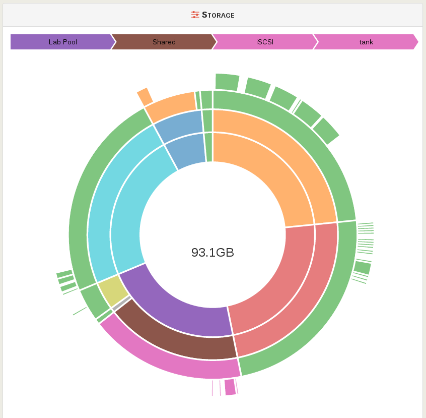
- The total SR disk capacity of the pool, compared to every other pools (first circle, proportional)
- The host total disk capacity (or just SR if shared), compared to the pool (second circle)
- The SR disk capacity, compared to the host (third circle)
- The VDI used space, compared to the SR
Example
For example, I would like to find the biggest VDI on our test pool, called "Lab Pool", let's hover the sunburst:

As you can see here, that's the VDI called "tank" which is the biggest, with a 93.1GB of physical space used. This VDI is on a Shared SR called "iSCSI", in our "Lab Pool". By clicking on the SR, you go directly to the SR view.
Here the result in video:
More
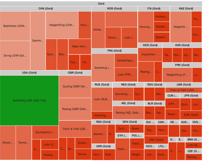
As I said before, another cool way to do it is the Tree map, which looks like this:

It allows to display labels directly on the graph. This will be probably also created in a near future.
