Announcing Xen Orchestra 5.x
Just after our initial release of Xen Orchestra 4.8, I'm proud to announce that we started to work for a new major release: Xen Orcestra 5.0, the web interface for XenServer. This first milestone of our new 5.x branch will be awesome, believe me!
So why a new major version? This future release will act the end of our complete web client rewrite, xo-web.
In the mean time, we'll continue to make new releases on the 4.x at the same pace.
Years of feedback
The choice of rewrite the web client is due to huge amount of feedback during years, from our users and even from our teams.
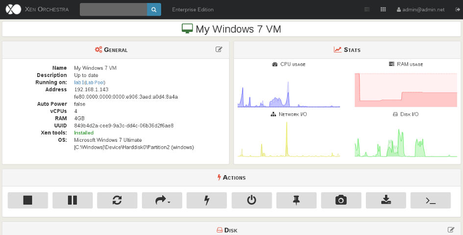
We drew the current interface ~1 year ago, and since then, we added a great number of features, by "stacking" them in the web client.
That's why some views started to became really busy!

But that's not the only reason: we didn't even imagine that XOA would be used on very large infrastructures (1500+ VMs!). In these conditions, it leads to:
- Bad UX from this huge number of elements
- Performances problems for this very high number of objects (but we already solved the server part, twice).
Now, after the feedback of our users with all the various ways to use XOA, and our own utilization, we are able to see what's really matter.
Making choices
Few weeks ago, we started to write guidelines, to have a "common theme" for the whole web client. Few examples: max number of data per type of view, global behavior, things to avoid, performance in mind from the start, etc.
This is the foundation of the next step: drawing mockups. And we are exactly here!
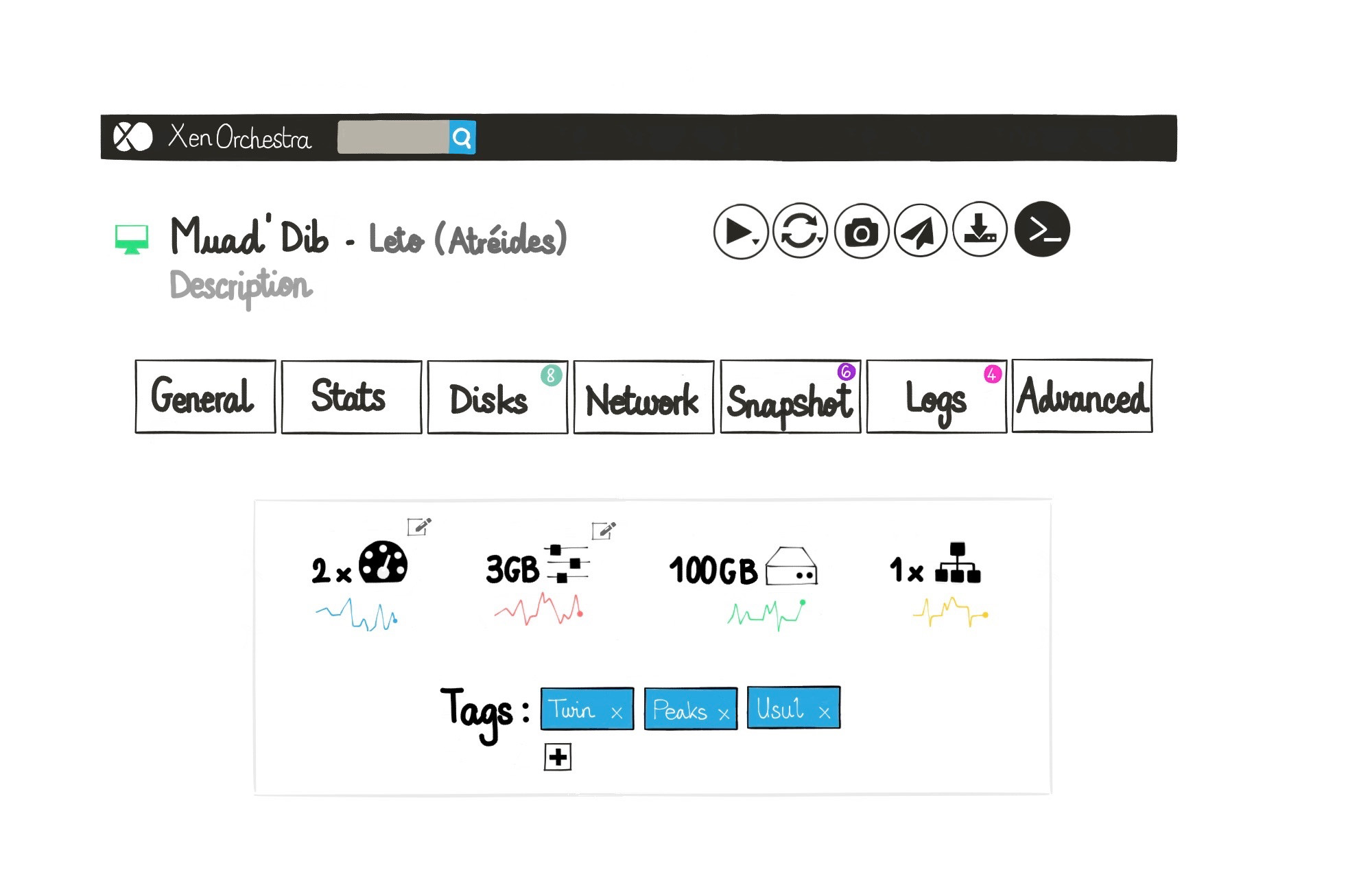
The first view we worked on, is the VM view. The goal is to display quickly all the vital data to the user. So you have to make choices, by hiding less important data for example.
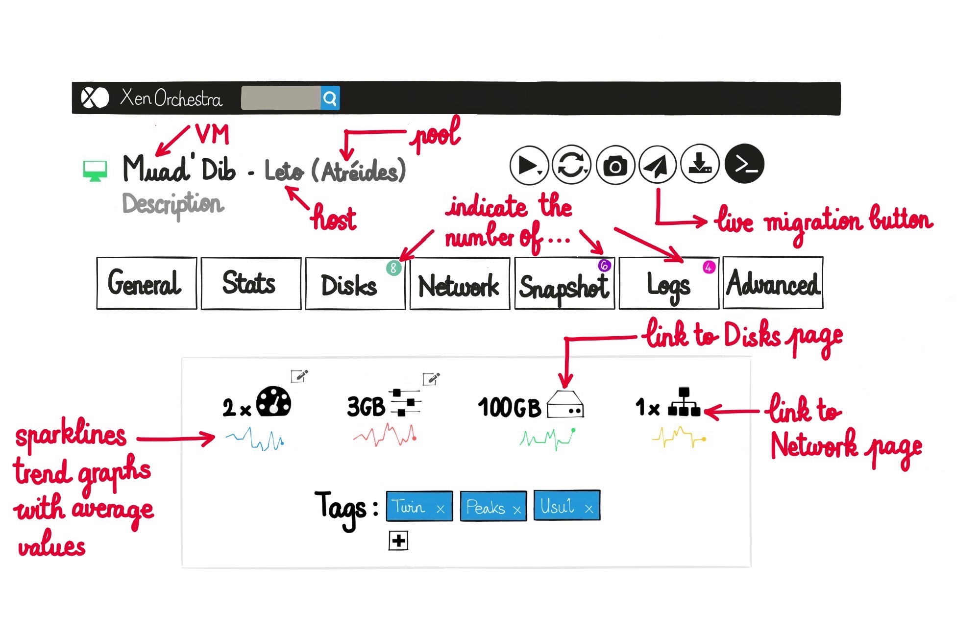
Our first draft (far from be definitive) look like this:

Want some details? Ok!

- Display less data at first sight, just keep the vital stuff...
- ... but display a way to access everything!
- Trends on performances are really important, even if they are just a rough summary: sparklines are ideal for that! By clicking on it, you'll go to the more details stats view
- Value editing should be obvious: just by clicking on an item, you would be able to change the value (Name, CPU, RAM etc.)
- Actions are very important and should be accessible anytime
So, if you have any comments or suggestions, go ahead in the comment section :)
Not only UI
In parallel, we just started to make a "real" HTML/CSS mockup, and think on more technical issues. Remember, the goal is to release something without regressions toward the 4.x. On this aspect, our initial choice is to use Angular2, which is far better from legacy Angular. Despite it's not officially released, we'll have this new beast to make everything as a component: no code duplication, easy maintenance and performance tweaking, etc.

When?
When it's done © ;) But be sure we'll do our max to release the best possible web interface for XenServer at our current pace, which is just... fast!
Until then
This new 5.x thing won't stop us to release exclusive features. Check our last blog post about a new surprise coming the the 4.9 :)
