Correlations on your infrastructure
Correlations
(Noun)
A reciprocal, parallel or complementary relationship between two or more comparable objects
What about that? Well, you'll see, correlations are a very important thing to help you every day.
We'll show you how we leverage the XenServer API to give you hints about what's happening in your virtualized infrastructure.
TL;DR? Okay, just a quick preview:
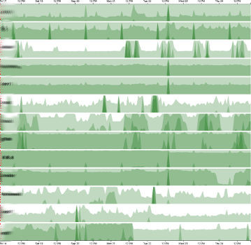
On your infrastructure
Let's explore what we already have and what we need.
Existing solutions
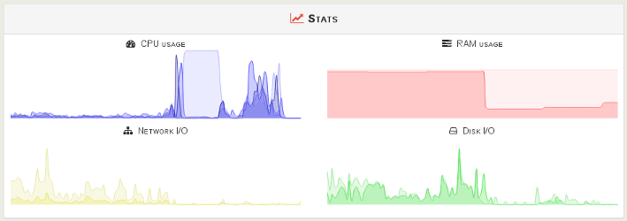
Having stats and metrics on your infrastructure is a very common thing in IT now. For example, Xen Orchestra already offers you instant statistics in a VM or a host view:
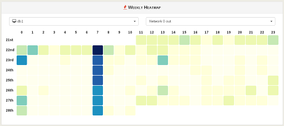
We also introduced the concept of heatmap to notice the differences or "hot spots" on the last 7 days:
A missing piece
One thing is missing: what about displaying the same metric for various hosts or VM? You should be able exploit this possibility to correlate through the time any spike or remarkable value.
But there is multiple challenges:
- compare various VMs or hosts in a limited (but visible) space
- the "two scales" problem: you'll understand it just below
The solution?
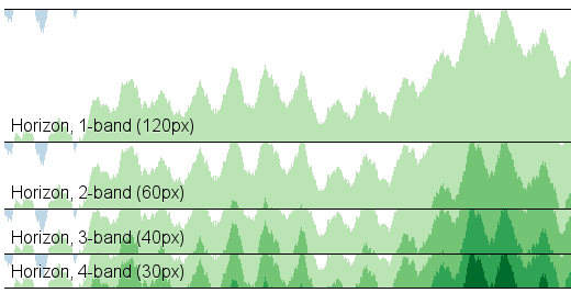
Let's tackle the first problem: limited vertical space. A classical line graph or area chart will be "flattened" when displayed in a small vertical space.
If you compress a 120-pixel tall area chart to 30 pixels, you lose 75% of the resolution and it becomes harder to see small changes
Source: https://square.github.io/cubism/
That's why the concept of horizon charts is really good: larger values are "overplotted" in successively darker colors.
Example:
Okay, done! Next :)
What about the "two scales" problem? When you compare multiple objects, you can also have some of them with far higher values than others, thus hiding small correlations. But also sometimes, we need a "synchronized" or consistent scale. How to choose between those? The answer is: let the user make the choice!
In practice
Let's display the network interface n°1 upload for 14x VMs used in production, with a "synchronized" scale (consistent):
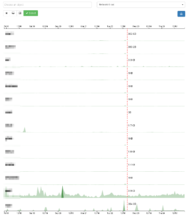
Okay, we can note:
- the second to last VM upload a lot more data than all others
- it seems there is a small spike on all other VMs, just left of the red cursor/line
- the "balance" icon is in blue, indicated a consistent scale between all VMs.
Let's deactivate the consistent scale on this very graph and see the result:
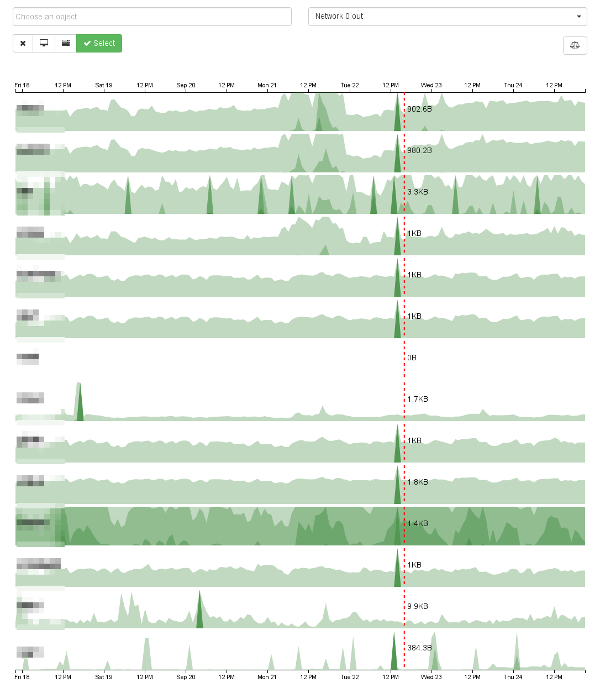
Do you notice it? This spike on all VMs is now visible because each VM has its own scale. For those wondering: it came from a Salt Stack pkg.upgrade command.
And with hosts? Thanks to our data consolidation, we can have an average on all CPUs of your servers and compare them:
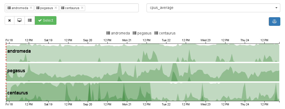
Yeah, "Centaurus" is working more than "Andromeda", that's obvious ;)
Going beyond
There is some room from improvement:
- display more hosts/VM (reducing the height of objects depending of their number)
- various time frames (not only week, but also day or month)
When?
This feature will be available... tomorrow in the next release of Xen Orchestra (4.6). Stay tuned!
