
Dashboard and dataviz

Recently, we started to work on a new view for Xen Orchestra: a global dashboard for your whole XenServer infrastructure.
Because of Xen Orchestra architecture, we can be connected to all your XenServer pools at the same time. But for displaying the data, there are some challenges, like:
- be able to get quickly all the critical data in a few views
- single out where the bottleneck is
- highlight the most resource-intensive VMs
- discover when your infrastructure is under heavy load
- and more...
Screenshots in this blog post are work in progress!
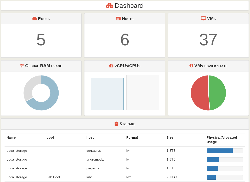
Dashboard
The first (main) view of the dashboard gives:
- the total numbers (pools, hosts, VMs)
- the global RAM usage (on every pools)
- the vCPUs used ratio on physical CPUs
- proportion of VMs states (halter, running, paused...)
- the storage list, by relative space occupied first (this way, you could see immediately the fullest disk)
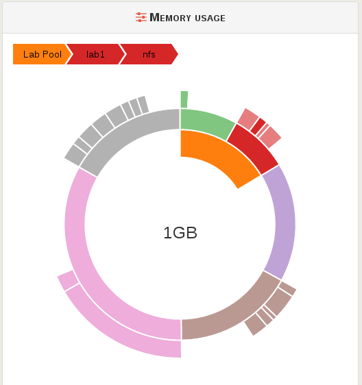
Resource usage
In a big infrastructure, you may want to find easily which VM uses the most resources, like you want to know which file taking all the space on your personal computer. We are using the Sunburst tools from d3js library.
By using the XenServer hierarchy, pools (if any) then hosts, and finally VMs, we can manage to build a very powerful representation of resource usage.
Hovering the graph, you get details in the labels, here for "nfs" VM running on the host "lab1", on the pool "Lab Pool". You can see on the graph, the VM max (total) RAM:
- "nfs" takes only a small portion of the "lab1" host
- "lab1" represent the half of RAM available in the pool
- the center indicates the RAM quantity in GB
On the other hand, you can see clearly a VM using a huge amount of RAM (in pink)! And you can see it won't fit in "Lab Pool"!
Just a start!
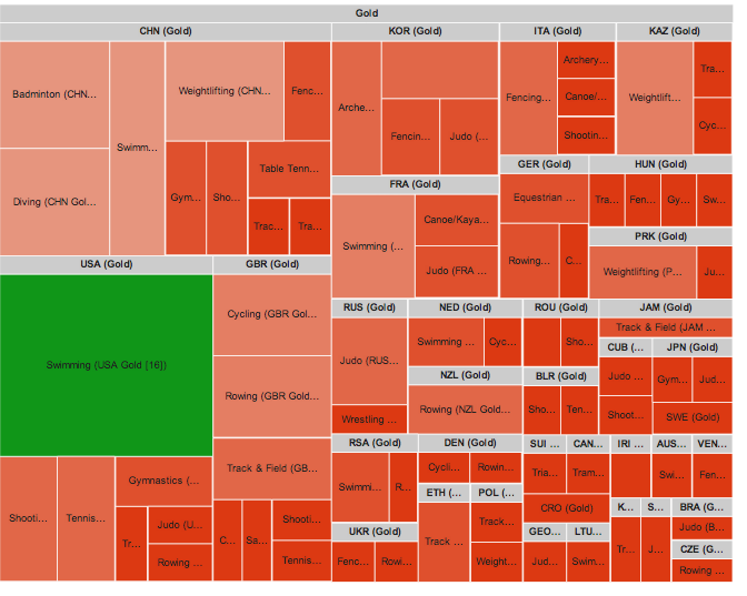
For sure, that's just a start. We'll continue to dig into this. For example, sunbursts are cool, but we also have the Treemap possibility (here a example):
But let's go further: coupling those visualizations with XenServer metrics, we could imagine, for example, to make a weekly heatmap, showing when your infrastructure is under heavy load (by choosing the metric, e.g CPU or disks write):
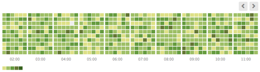
This way, you can adapt your strategy.
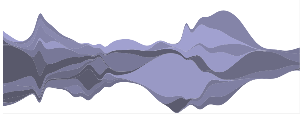
What else? Well, for stacked time series, steamgraphs are also nice. You can imagine to stack multiple VMs on the same metrics in this graph:
Compacted time series are also possible thanks to the Cubism lib:
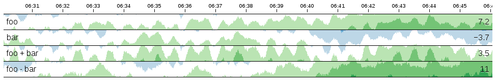
You'll see quickly which one (and when!) eats your SAN by selecting the "disk writes" metrics for example.
Final challenge
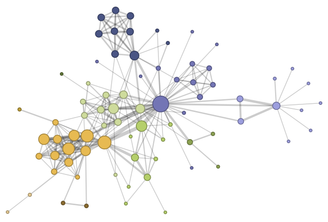
How to display the maximum metrics on the whole infrastructure in one graph? We got some ideas, like the force directed graph with various node in size/color, it could be very powerful:
When???
The first dashboard (+ sunburst) will be operational for the next 4.4 release this summer!
If you have other ideas or suggestions, go ahead, the comment section is here for this ;)